About the project
As part of Home Depot’s ongoing effort to enhance its mobile experience, the next evolution of the app focuses on empowering DIY enthusiasts with a dedicated Project Planner feature. User research revealed a strong desire for a centralized tool that helps users brainstorm, plan, track, and document their home improvement projects.
This case study explores the early concept phase of the DIY Project Planner—an expandable ecosystem designed to grow with users’ needs. While the first version of the tool focuses on essential features, like project tracking and task management. Future iterations could incorporate features like budgeting tools, collaborative forums, tutorial libraries, and shared progress logs for both individual and group projects.
Home Depot Project Planning App
Details
Role: 4 UX/UI Designers - Jerrid Jones (UI Designer), Sarah Robinson (UX Designer), Chloe Connell (UX Researcher), Hannah Michelle (UX Lead)
Timeline: 2 Week project
Tools: FigJam, Figma, Figma Slides, Chat-Gpt, Maze, Google Workspace, Slack, Zoom
Deliverables: User Interviews, Comparative Analysis, Persona, Problem Statement, Mid-Fi Prototype, Hi-Fi Prototype
The Challenge
The Process
Brainstorm
Help users generate and capture creative project ideas with intuitive tools
Plan & Track
Organize materials, timeline, and project steps with smart planning tools
Document
Capture progress and share completed projects with the community


User Research
We interviewed five DIY enthusiasts to understand their project habits and identify pain points in their current workflow.


Discovery
🔬 Research Insights
Most began by researching projects on websites
Used phones to take notes while working on tasks
5 interviews conducted with DIY enthusiasts
🔑 Key Pain Points
Making multiple trips to the store
Scattered notes with no central organization
Underestimating project timelines
How might we bridge the gap between DIY inspiration and successful project execution?
👥 User Quotes
"I always end up forgetting something and have to go back to the store—sometimes more than once."
"I've got notes all over—but I wish it were all in one place."
"It's hard to know how long a project will take. I usually underestimate."
"I find great ideas, but they're scattered across Pinterest, Blogs, and Instagram with no way to save or compare them in one place."
Comparative Analysis
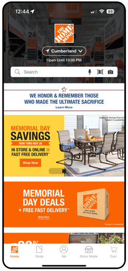
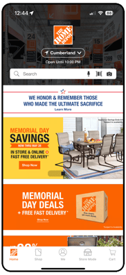
While The Home Depot app offers robust shopping capabilities, it currently lacks integrated DIY project planning features—these are only accessible via the website. To inform our design process, we also drew inspiration from key features in the Crouton app, particularly its approach to organization and task management.
Home Depot App
Strengths: Strong shopping features, brand recognition
Gap: No integrated project planning tools on mobile
Competitive Apps
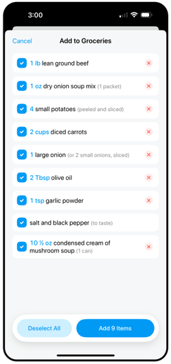
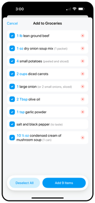
Crouton: Clean organization and task management
Insight: Content may be too robust for our target users who prefer simplified experiences

Problem Statement
"Jamie needs a way to accurately plan and effectively track projects so she can have a clear roadmap leading to a successful project"
How Might We...
• How might we make tracking projects easy & intuitive?
• How might we make tracking projects fun?
• How might we streamline users' idea execution?
• How might we assist in accurately planning projects?
• How might we give users tools to accurately plan?
• How might we encourage users to track projects?
Define
Design
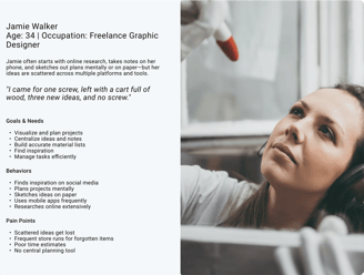
Primary User Persona
Feature Exploration
After synthesizing our research, we identified three key priority areas that are most important to users when managing their DIY projects:
Material Planning
Accurate material lists and shopping integration
Task Management
Step-by-step project tracking and organization
Time Management
Realistic time estimates and progress tracking
Build material checklists
Space for detailed dimensions & photos
Tool requirements planning
"Where to buy" feature integration
Task checklist system
Disruption markers for chaotic tasks
Photo storage & note-taking
Project collaboration features
Suggested time estimates for common tasks
Progress bar indicating completion
Notes for common project hangups
AI assistant for time estimation
Information Architecture
Project Dashboard (home screen)
Discovery feed with project cards
Photos/sketches/notes integratio
Timeline view & project pages
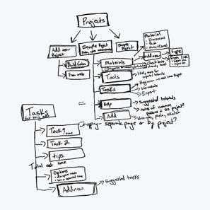
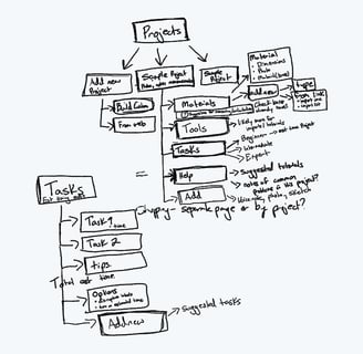
Sketches
Here’s a look at our early exploration of information architecture, including rough wireframes of key screens like the project dashboard— which shaped our final design— and the “add a project” page.
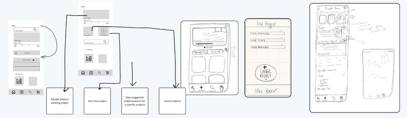
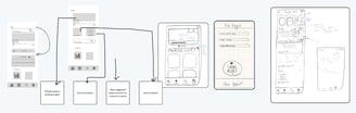
Wireframes
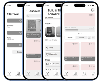
From our sketches, we built mid-fidelity wireframes for key screens: the project dashboard, individual project page, discovery feed, and manual project builder.
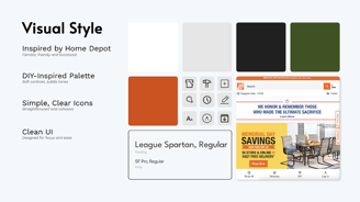
Visual Style
Our visual design approach focused on familiarity and usability:
Brand Alignment: Leaned into Home Depot's existing style for familiarity while making modern refinements
Color Psychology: Used near-black and near-white to create a softer, less eye-straining experience
Iconography: Minimal but intentional icons that tie into the Home Depot aesthetic
User Focus: Kept the interface uncluttered to support user focus and reduce distraction

Usability Testing Results
User Feedback
"Clicked through all the buttons and made my own project and discovered an existing one but the task bar didn't update so I couldn't figure out how to move forward!"
"I prefer to see the steps one at a time with each new screen."
"The project home page confused me at first, but I eventually found the 'Create Project' button at the bottom. I would rather have it at the top, as my eyes naturally look for things in that position."
7.2
Average Overall Experience
100%
Task Completion Rate
182.7s
Average Duration
5
Testers (iPhone 16)


Testing Takeaways
Not having everything clickable in the prototype resulted in some confusion, though 100% of users still completed tasks
Users achieved the assigned task according to heatmap data, indicating good core functionality
Would benefit from more testing with a fully interactive prototype to gather more actionable insights
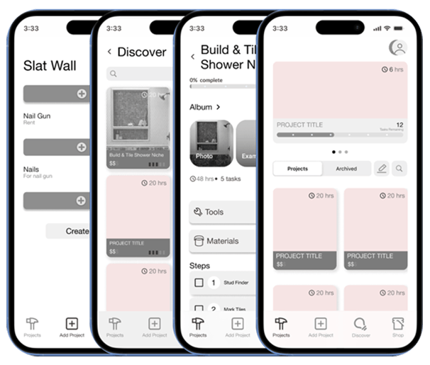
Hi-Fi Prototype
Hi-Fi Prototype Highlights

Project Detail Screen
Central hub for creative inspiration and practical planning where users can upload photos, sketches, and notes.
Creative inspiration meets structured planning
Multi-format content support
Integrated material list building
Discover Screen
Browse project ideas with time, cost, and difficulty displayed upfront for informed decision-making.
Quick project browsing
Transparent project metrics
Direct Home Depot app integration
Project Details
Interactive materials list with disruption markers and flexible planning that adapts as projects evolve.
Interactive material checklists
Disruption markers for planning
Flexible, editable project plans
Next Steps
We identified several exciting opportunities to enhance the app further:
Smart AI Assistant
Automatically suggest tasks, offer tips to avoid common mistakes, and recommend tailored tutorials.
Linked Materials
Make every material hyperlinked for easy viewing and purchasing directly from the app.
Built-In Break Points
Allow users to mark smart stopping points within task steps for better project management.
Social Inspiration
Browse real projects from other users, see completion times, and access pro tips and notes
Customizable Detail Level
Toggle project detail levels including time estimates and disruption markers based on user preference.
In-App Tips & Tutorials
Context-aware guidance throughout the app with material calculations and task-specific tutorials.
Key Takeaways & Lessons Learned
What Worked Well
Strong user research foundation led to clear problem identification
Feature prioritization based on user needs created focused solutions
100% task completion rate demonstrated core functionality success
Recipe app inspiration proved valuable for step-by-step planning
Areas for Improvement
More comprehensive prototype testing needed for better insights
UI element placement requires optimization based on user feedback
Step-by-step flow presentation could be enhanced
Interactive prototype completeness affects user testing quality