About the project
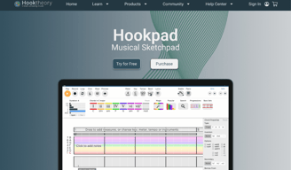
Hooktheory is a beloved music education platform, but its interface felt dated and overwhelming, especially for new users. Our goal was to reimagine the site experience, making it more intuitive, inclusive, and professional to better serve both new learners and experienced musicians. Using the Double Diamond process, we focused on converting free users of TheoryTab into paying Hookpad customers, without losing the platform's educational core.
Hooktheory ReDesign
Details
Role: 4 UX/UI Designers - Jerrid Jones (UX/UI Designer), Andreis Hernandez (UX Lead), Robert Newman (UX Researcher), Rachel Arnett (UX Writer)
Timeline: 3 Week project
Tools: FigJam, Figma, Figma Slides, Chat-Gpt, Trello, Maze, Otter AI, Google Workspace, Slack, Zoom, Photoshop
Deliverables: User Interviews, Usability Studies, Affinity Map, Competitive and Comparative Analysis, 2 Persona, Problem Statement, HMW, Site Maps, Mid-Fi Prototype, Hi-Fi Prototype
The Process
Client Goal
Convert free users into paid Hookpad customers through better design and user flow.
Three Clear Goals Emerged
1. Clarify the User Journey
Make TheoryTab and Hookpad more discoverable and intuitive for all user
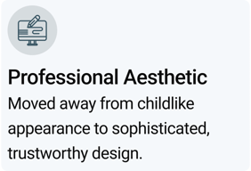
2. Elevate the Brand
Shift from a childlike visual identity to a sleek, professional aesthetic.
3. Design for All Levels
Engage both beginner explorers and seasoned composers effectively.
Current State Issues
Dated visual identity feels juvenile
Interface favors professionals over beginners
Key features hard to discover
Poor conversion from free to paid
The Core Challenge
Hooktheory's design didn't communicate its full value to first-time visitors. Advanced users thrived, but beginners were overwhelmed. The platform needed a more inclusive and easier user experience with updated navigation and information architecture.
Direct Client Request:
"We want to create a conversion with the users that are coming in through our free creative tool, TheoryTab, into paying customers with our powerful tool, Hookpad."
Discover
Research Approach
We conducted comprehensive research to understand both the platform's current state and user needs. Our multi-method approach ensured we captured both quantitative usability issues and qualitative user experiences.
Research Methods
Heuristics Analysis
There were a lot of repeat information that needed organizing and condensing.
The colors and font styles were needing a refresh. Everything felt dated and some things felt juvenile.
A lot of the information is presented to professionals and does not engage the novice.
The placement of a lot of the content was not easy to find.


The initial research phase covering heuristics analysis, competitive research, and user interviews to understand current pain points and opportunities.
Key Discovery
"Advanced users thrived, but beginners were lost. Hooktheory's current branding and layout didn't give new users the magic it offers."


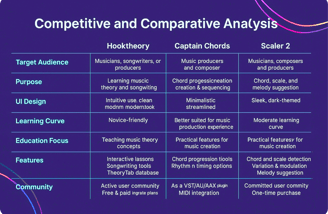
Competitive and Comparative Analysis
Looking at the competitors website we were able to see what they were offering and how they were presenting them. All of these websites had UI designs and functionality that we felt would be beneficial to keep in mind as we progressed, focusing mainly on the aspects of target audience, purpose, UI design, learning curve, education focus, features, and community.
User Interviews
Over 7 interviews with current and past users to identify pain points and drop-off reasons.
User Quotes:
"I want to build my music skills, even if it’s not my full career."
"I want a layout that doesn’t feel like you're trying to constantly sell me something."
"I want an intuitive layout with identifiable icons and a modern look."
Key Pain Points Identified
Information Architecture
There was a lot of repeat information that needed organizing and condensing.
Rebranding
The colors and font styles were needing a refresh. Everything felt dated and some things felt juvenile.
Inclusivity
A lot of the information is presented to professionals and does not engage the novice.
Intuitiveness
The placement of a lot of the content was not easy to find.
Key Insight
Our research revealed a split: Advanced users thrived, but beginners were lost. Hooktheory's current branding and layout didn't give new users the magic it offers.
Define
User Personas

Synthesizing our research findings into clear personas and problem statements that guide our design decisions.
Problem Statements
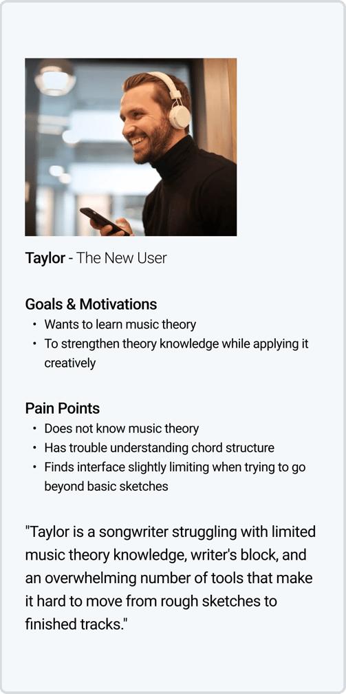
Taylor's Problem
Taylor needs a clearer, more intuitive way to learn chord structure, explore song ideas quickly, and organize their creative work—all while staying inspired and building a strong foundation for professional-quality music.
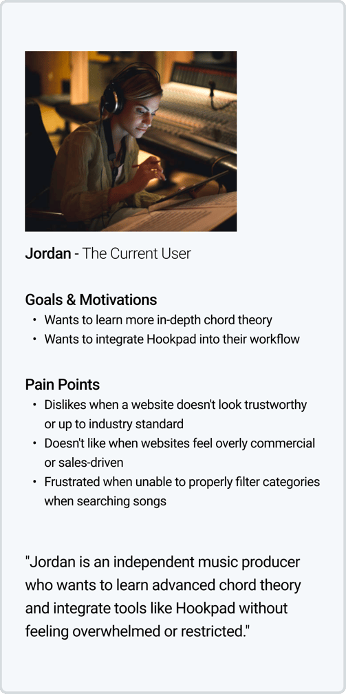
Jordan's Problem
Jordan needs a clean, trustworthy platform that supports creative freedom, offers flexible ownership options, and makes it easy to discover and learn from niche music.
How Might We...
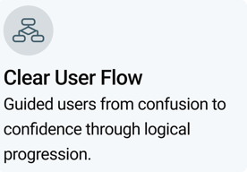
HMW make it easier for the user to confidently begin their musical journey?
HMW guide the user from exploration into creation more fluidly?
HMW make a more inclusive environment for new users without ostracizing professionals?
HMW encourage new users to try the products without pushing it on them?
Develop
Design Strategy
Translating insights into tangible design solutions through wireframes, prototypes, and a cohesive design system.
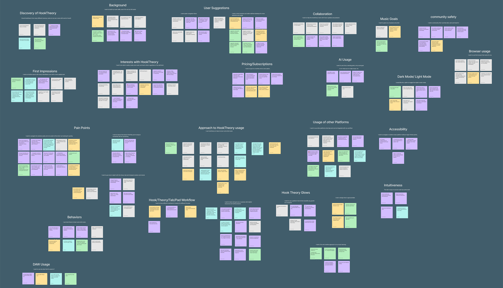
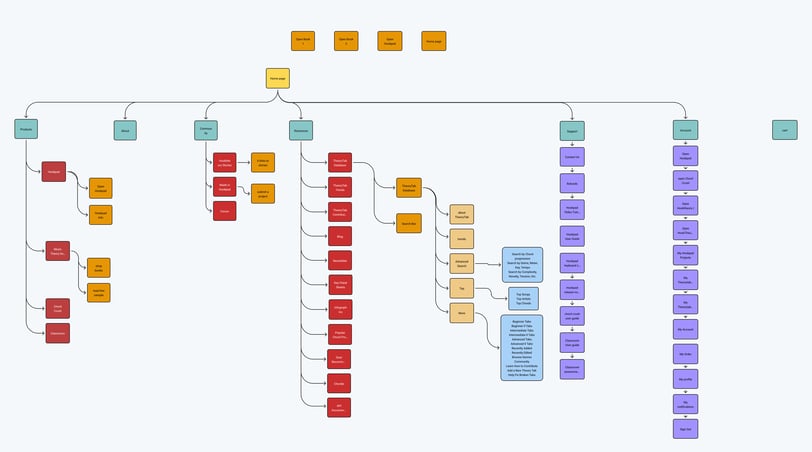
Sitemaps
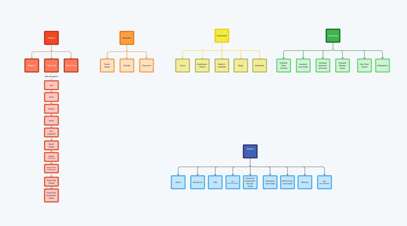
What you're looking at is the current site map of Hooktheory—and as you can see, it’s quite extensive. Given that Hooktheory serves both as an educational resource and a music creation tool, it’s understandable that the navigation has grown increasingly complex over time.
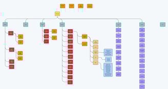
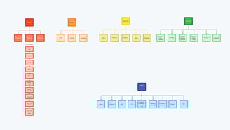
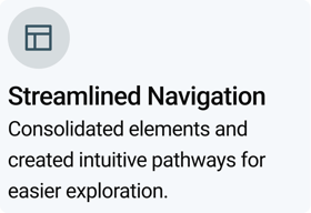
This is our proposed new site map—a more streamlined navigation structure designed to serve both your existing users and newcomers visiting for the first time. Our goal with this updated site map is to create a clearer, more intuitive experience that reflects Hooktheory’s dual mission and supports user discovery and engagement.
Prospective
Typography
Retrospective
Given the existing site structure and time constraints, we moved directly into design rather than starting with sketches. Our approach balanced Hooktheory's educational foundation with modern, professional aesthetics.
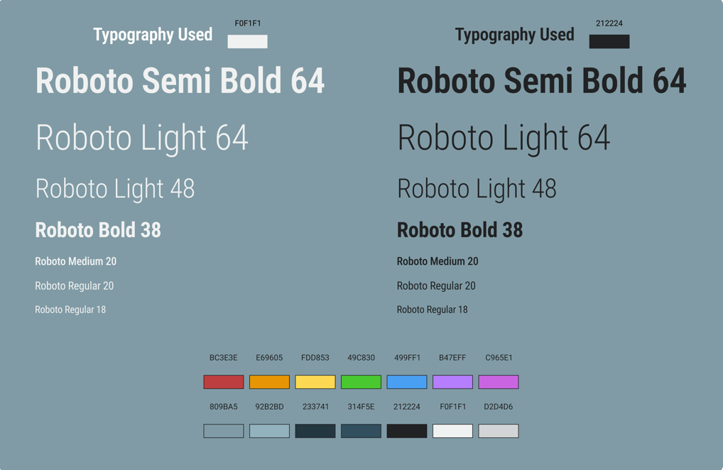
Font Family
Roboto offers clear readability across all screen sizes, ensuring accessibility for both advanced users and beginners.
Hierarchy
Clear type scale supporting both educational content and modern interface elements.
Background
Deep blue-gray to soft neutral gray gradient gives the site a polished, professional look that builds trust.
Brand Colors
Hooktheory's rainbow palette as hidden hover states to reinforce brand identity while maintaining clean interface.
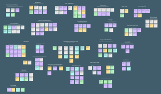
Color Palette
Design System
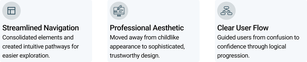
Key Design Improvements
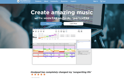
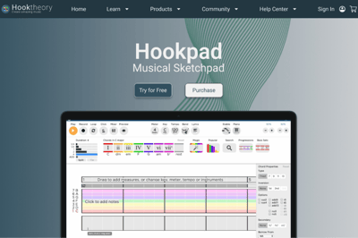
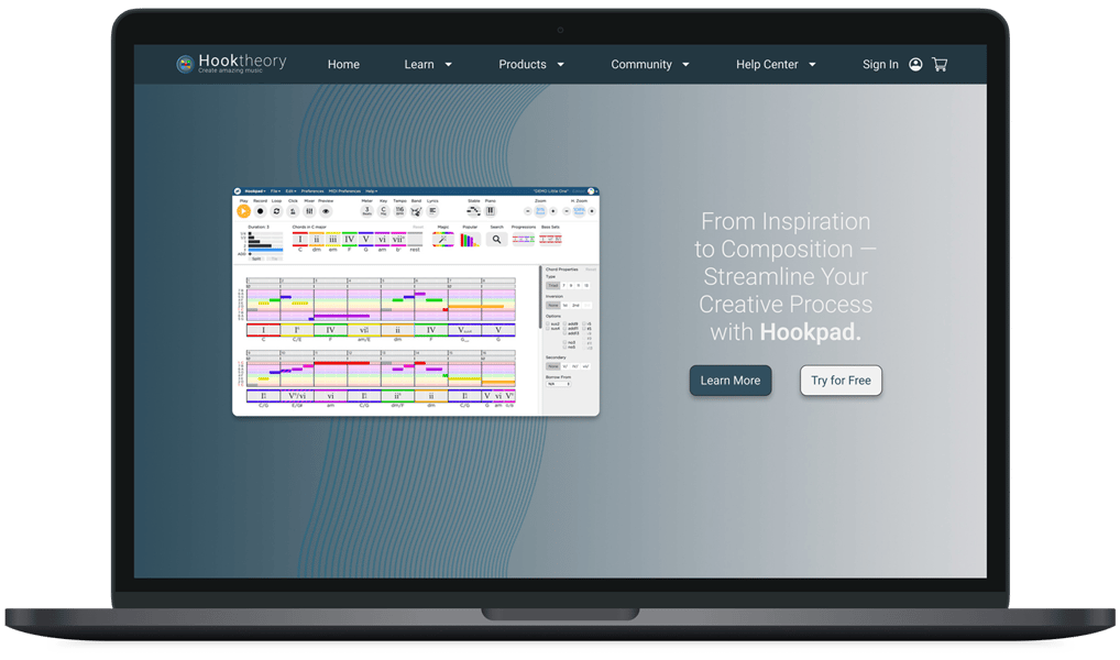
Hero Section Redesign
Improved CTAs, button placement, and color to encourage exploration without pressure to purchase.
Content Organization
Prioritized giving each section ample space to "breathe," creating a clean, uncluttered layout that feels approachable.
Enhanced Navigation
New side navigation makes existing flows more accessible, with breadcrumb navigation for better orientation.
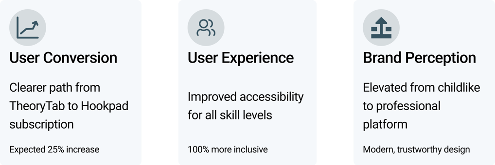
Design Impact
Our design solutions directly addressed the core problems identified in research. By focusing on the highest-performing products and features, we created a scalable foundation for future enhancements.
100% More Professional
50% Reduced Clutter
Deliver
Usability Testing Approach
Testing our prototypes with real users to validate design decisions and gather insights for future iterations.
User Feedback
Important Note: Limited time constraints allowed for only one moderated study. More comprehensive testing is needed for deeper insights.
Key Takeaways
Prototype
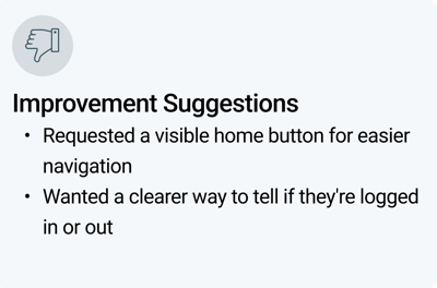
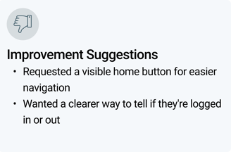
Areas for Refinement
Need for better wayfinding elements like a visible home button and clearer login status indicators to improve user orientation.
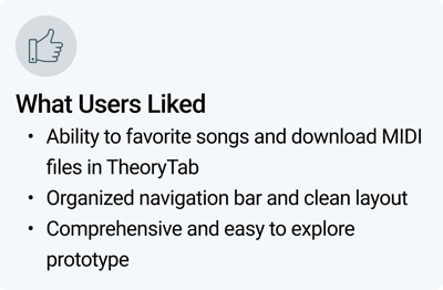
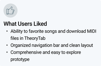
Positive Reception
Users responded well to the clean, organized layout and intuitive navigation. The ability to favorite and download content was particularly appreciated.
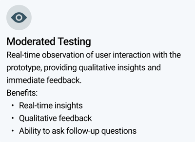
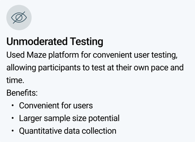
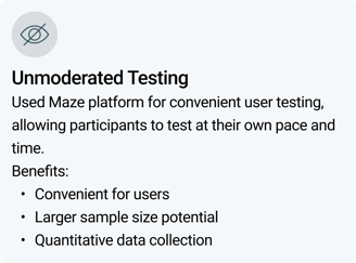
Method
Unmoderated Testing (Maze)
Testing Results
Participants
6 users
Tasks
6 tasks
Completion Rate
100%
Notes: All users completed tests with minor misclicks on one task
Method
Moderated Testing
Notes: Do to time constraints we were only able to do one moderated study, This is good feedback but it’s just not enough data for a comprehensive study.
Participants
1 user
Tasks
Full prototype walkthrough
Completion Rate
100%
Next Steps
Project Impact & Outcome
Strategic recommendations for continuing the Hooktheory redesign journey and maximizing user conversion and engagement.
Recommended Next Steps
Expand Usability Testing
Conduct more comprehensive usability testing to gather better insights and continue refining the new UI.
Success Metrics & Impact
Hooktheory's redesign now serves as both a creative catalyst and a learning tool—empowering users to explore music theory with confidence and clarity.
Our transformation addressed the core conversion challenge while maintaining the platform's educational excellence and serving users of all skill levels.
Build Comprehensive Design System
Create a more comprehensive design system for the website with detailed components and guidelines.
Enhanced User Research
Conduct more extensive user research to better understand how to balance the needs of new and existing users.
AI Assistant Integration
Research how to position Aria as an AI tutor that guides users, ensuring users don't think AI is writing songs for them.
Theory Book Integration
Enhance content by integrating Theory Book insights across key pages to give insight to color codes and nudge users towards books.
Personalization Algorithm
Develop Tab Theory Profile Algorithm for personalized suggestions when users are logged in.
Future Vision
This redesign establishes a strong foundation for Hooktheory's continued growth. The modular design system and clear user flows create scalable solutions for future feature development.
From a cluttered, overwhelming interface to a clean, professional platform that guides users from curiosity to creation. Hooktheory now truly serves as a creative catalyst for inspiring music makers.